Dataset
The dataset is used to import user signal data for time series projects, including data validity checking and data visualization.
Data Import
Import user training data into the project.
Loading Data Files
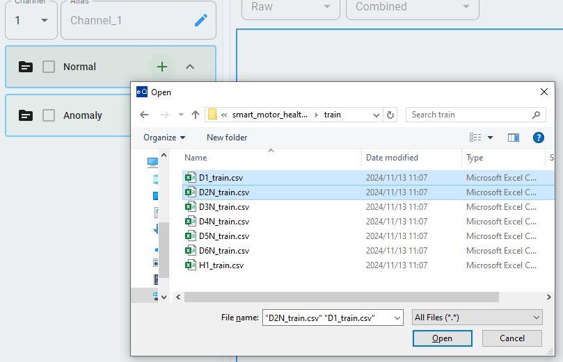
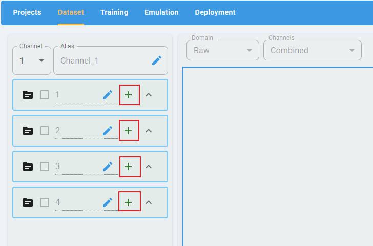
In any type of project, click the + button to open the file selection dialog.
Select the files to load. The data loader supports the selection of multiple files at a time.
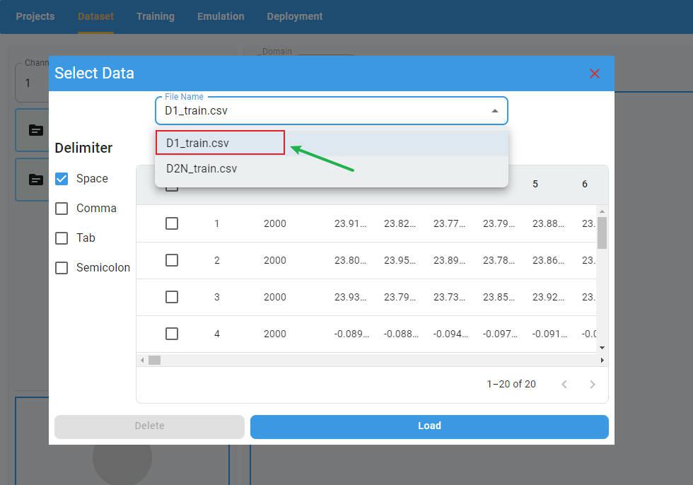
Data Preview
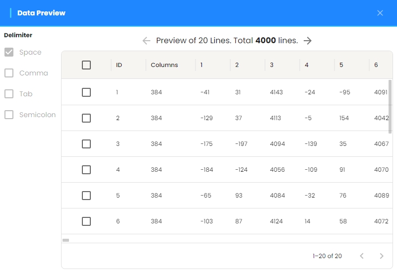
After selecting the data files, the preview screen appears with the delimiter selection panel on the left. The data display panel is on the right.
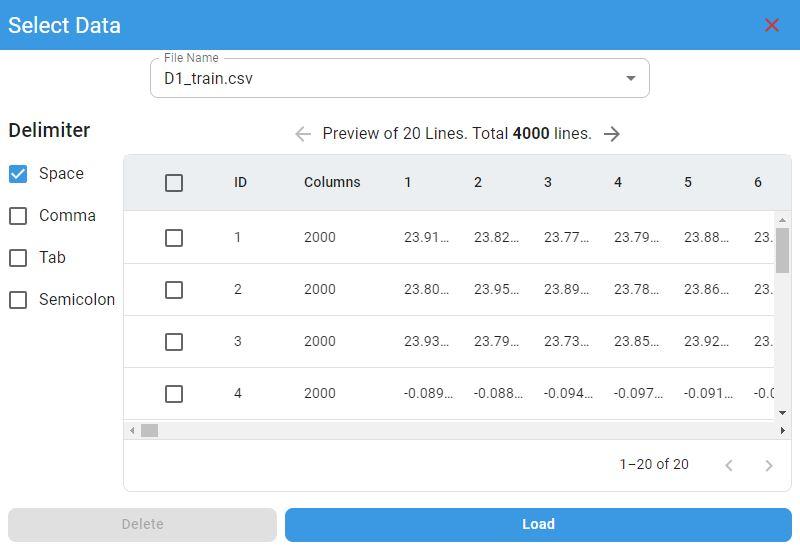
Delimiter Selection:
The default delimiter is space. If any other delimiter is used, select option 1 in the delimiter selection panel.
Multifile Preview:
If you have more than one file loaded at the same time, you can select the file you want to preview from the file list.
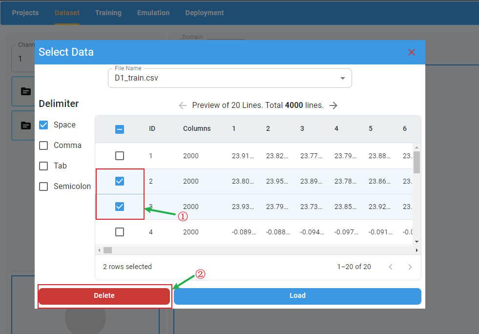
Delete Rows:
If you want to delete rows in the preview panel, select the rows to delete and click the Delete button. The selected rows will be deleted.
Load Data:
To load the data files in the preview panel, click the Load button. All imported files are loaded and the files are displayed in the list of imported files.

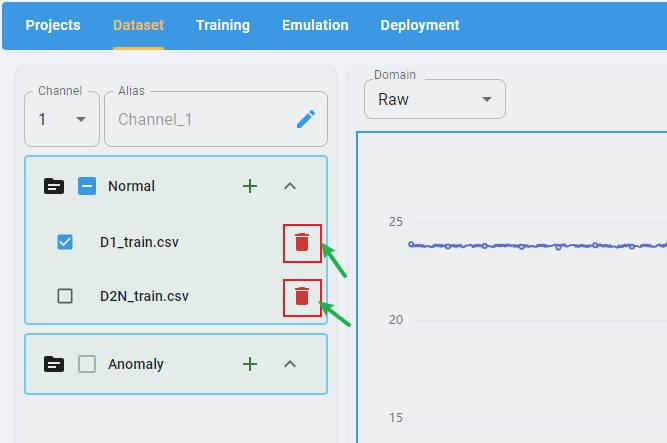
Delete Imported Files:
You can click the buttons beside the filename to delete the imported file.
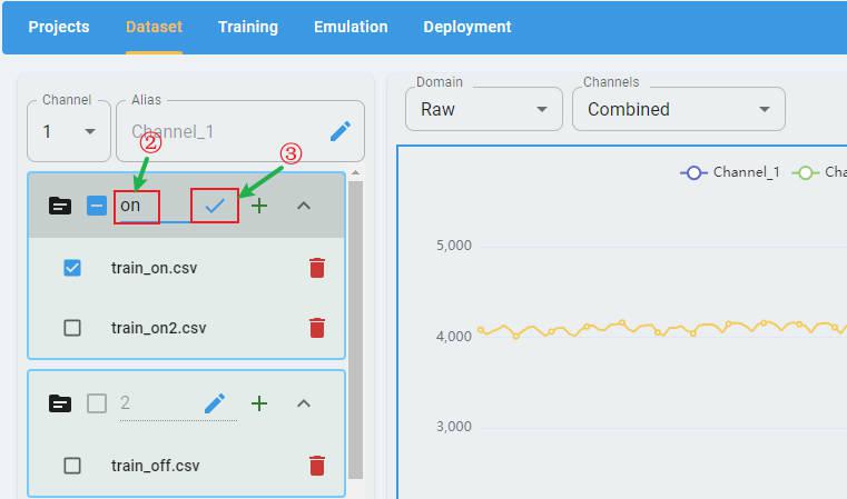
Rename the Channel Names
By default, the label of each channel is “channel” + index, such as “Channel-1”, “Channel-2”.

You can edit the alias of the channels to create new channel labels (optional).
Select a channel in the channel list, then click the edit button.

Input the new channel name. Click the check button and apply the rename.

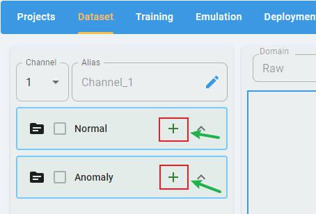
Anomaly Detection
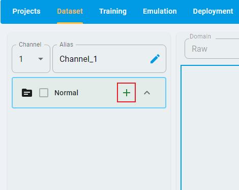
For an Anomaly Detection project, there are two classes of data files that must be imported: Normal and Anomaly.

Notes: You can only import Normal data if Anomaly data cannot be collected.
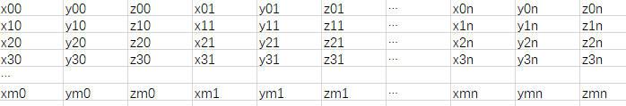
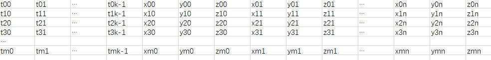
Data file format: One sample per row, containing all channels, with samples separated by delimiters (space, comma, tab, and semicolon). Here is a data file example that contains m samples with n values × 3 channels (x, y, and z). The channel is the last dimension.
n-Class Classification
For an n-Class Classification project, n (n≥2) classes of data files must be imported. Each class must have at least one data file loaded.
Data File Format:
One sample per row, containing all channels, with samples separated by delimiters (space, comma, tab, and semicolon).
Example: A data file containing m samples with n values × 3 channels (x, y, and z). The channel is the last dimension and uses the same format as Anomaly Detection.
Click the + button and load the data files for all classes.
By default, the label of each class is a class index. You can edit the alias of the class to create a new class label (optional).
Click the edit button.

Input the alias string and click the check button to apply the rename
1-Class Classification
For a 1-Class Classification project, only one class of data files is imported, which represents the positive class.
The file format is the same as Anomaly Detection and n-Class Classification.
Regression
The prediction targets of a regression project are continuous values. Therefore, you can put all data into one file (or split it into multiple files with no categories).
Data File Format:
One sample per row, containing all channels, with samples separated by delimiters (space, comma, tab, and semicolon). The first k columns (k is the target number, which is set when the regression project is created, k ≥ 1) are the target values to predict.
Example: A data file containing m samples with n values × 3 channels (X, Y, and Z), and k targets.
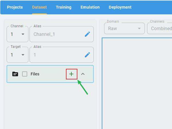
Rename Target Labels:
You can provide an alias for the target name for clarity (optional).
Select the target that you want to rename and click the edit button.

Input a new target name and click the check button to apply the rename.

Data Visualization
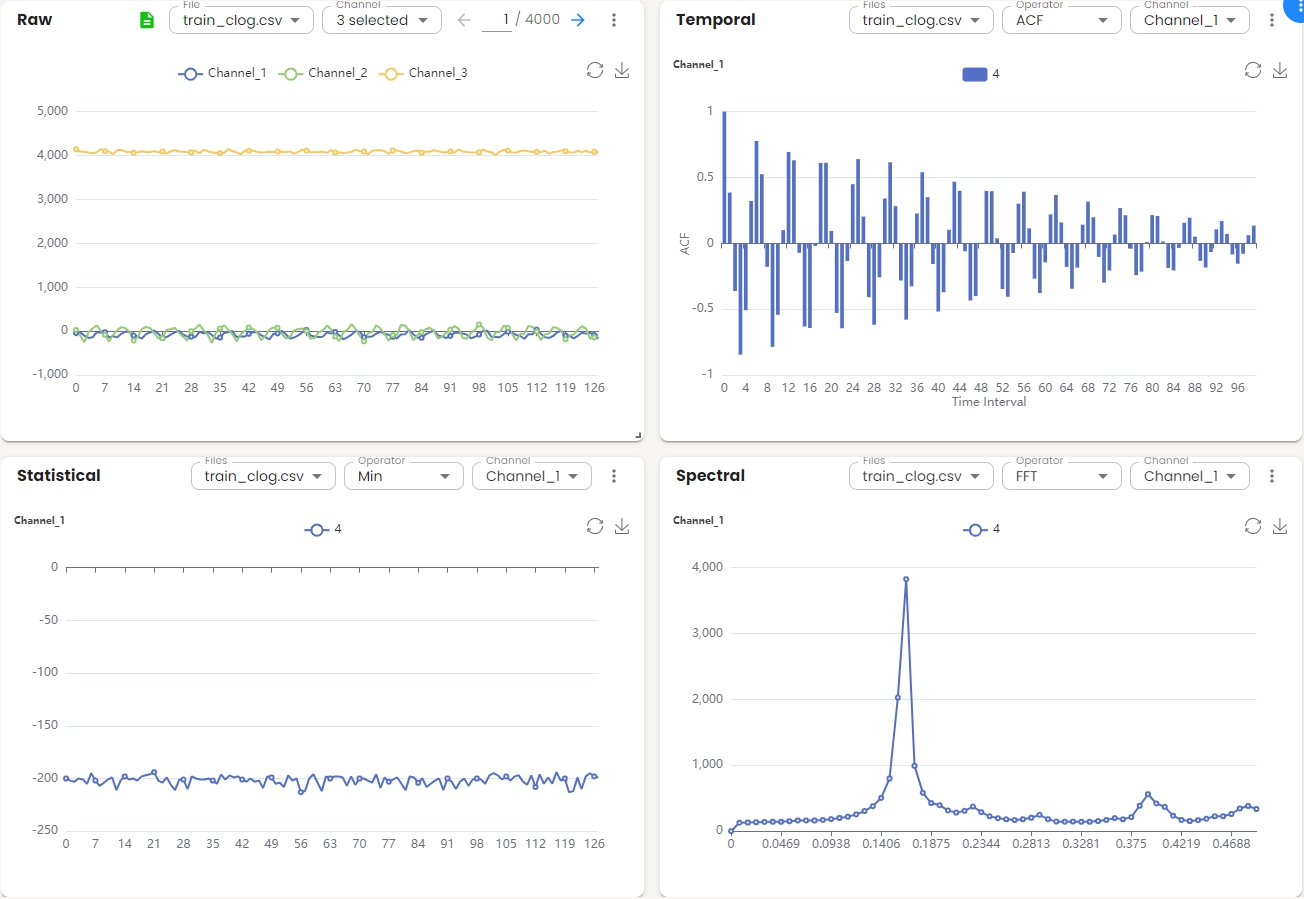
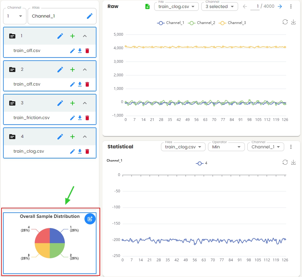
After the data files have been configured and loaded, the data visualization screen appears with a flexible widget layout. Multiple visualization panels are displayed simultaneously, allowing users to view the distribution of data in raw, temporal, statistical, and spectral domains at the same time.
Widget Interactions
Each widget supports independent manipulation:
Drag: Reposition the widget by dragging it to a new location within the layout
Resize: Adjust the widget size by dragging its edges or corners
Maximize: Expand the widget to full screen for detailed analysis
Close: Remove the widget from the current layout
Each widget header includes:
File/Files dropdown: Select one or more data files to display
Operator dropdown: Choose the analysis operator (varies by domain)
Channel dropdown: Select one or multiple channels to visualize
More options menu (⋮): Access more options including:
Expand: Enlarge the widget for a detailed view
Close: Remove the widget from the layout
Each widget context (chart) supports interactive features:
Zoom: Use the mouse wheel to zoom in/out on the chart
Restore: Return the chart to its original state
Download: Export the chart as an image file
Widget Layout Management
The blue menu button  in the top-right corner of the visualization screen provides layout management options:
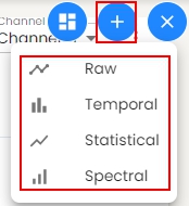
Add Widget:
Add a new visualization widget to the layout. You can compare the charts for different files or operators or channels.
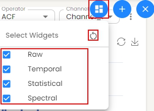
Select Widgets:
Choose which widgets to display or reset to the default 2×2 grid layout with all four visualization domains.
Visualization Widgets
The flexible widget layout displays four visualization domains simultaneously in a 2×2 grid by default.
Raw Domain Widget
Displays the raw signal data for the selected file and channels.
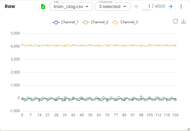
Basic Operations:
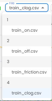
Select a file from the file list and display its data.
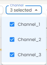
Choose one or more channels from the channel list to visualize.
Use the navigation arrows to browse through samples. For example, 1 / 4000.

Click the
 and preview the data.
Temporal Domain Widget
Shows temporal domain analysis for the selected files and channels. The x-axis represents the time interval, and the y-axis shows the correlation values.
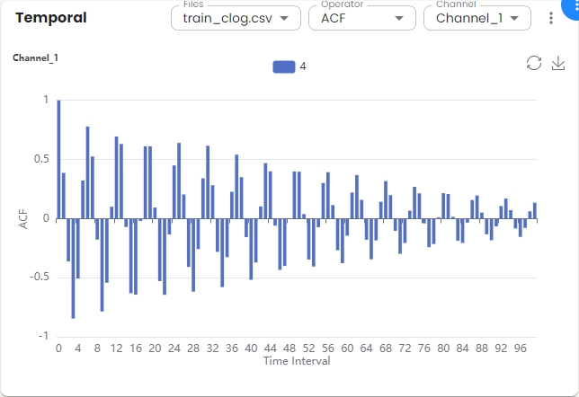
Basic Operations:
Choose one or more files from the file list and display the data.
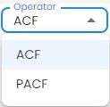
Select the operator (ACF or PACF) from the operator dropdown menu. Autocorrelation Function (ACF) is a statistical tool used to measure and analyze how a signal correlates with itself over different time intervals. It provides insights into how a dataset varies with itself at different lags. Partial Autocorrelation Function (PACF) measures the correlation between a time series and its own lagged values, controlling for the values of the intervening lags. This function is crucial for identifying the order of an autoregressive model. The function helps distinguish the direct relationships between observations at different time points without interference from other lags.
Select a channel from the channel list to visualize.

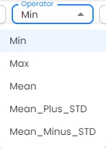
Statistical Domain Widget
Displays statistical analysis for the selected file and channel. The chart shows the statistical values across feature sets.
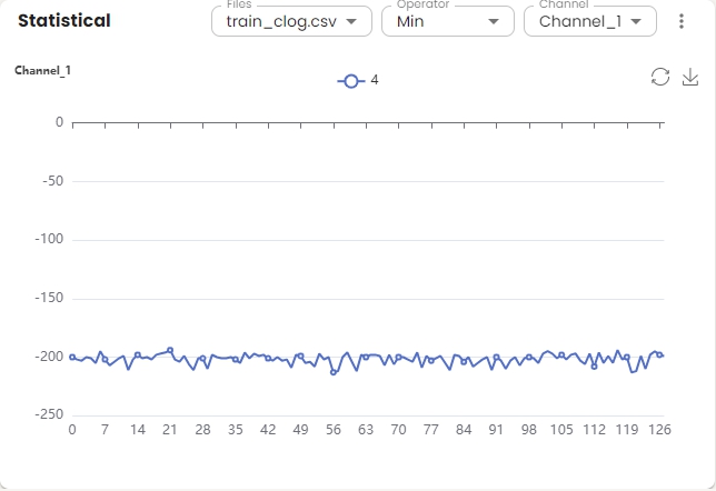
Basic Operations:
Choose one or more files from the file list and display the data.
Select the operator from the operator dropdown menu.
Select a channel from the channel list to visualize.
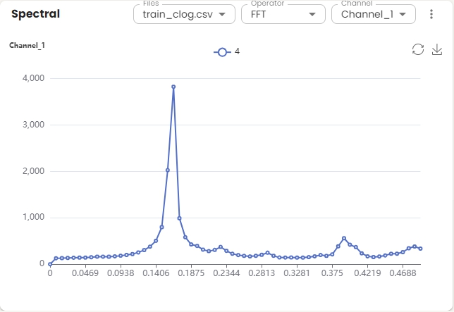
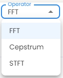
Spectral Domain Widget
Shows spectral domain analysis for the selected file and channel. The x-axis represents frequency (0 to 0.5), and the y-axis shows amplitude.
Basic Operations:
Choose one or more files from the file list and display the data.
Select the operator from the operator dropdown menu. Fast Fourier Transform (FFT) efficiently computes the Discrete Fourier Transform (DFT) and its inverse, reducing complexity from O(N²) to O(N log N). Cepstrum is the inverse Fourier transform (IFT) of the logarithm of the estimated signal spectrum. Short-Time Fourier Transform (STFT) is an extension of FFT that computes the Fourier Transform of short, overlapping segments of a signal over time.
Select a channel from the channel list to visualize.
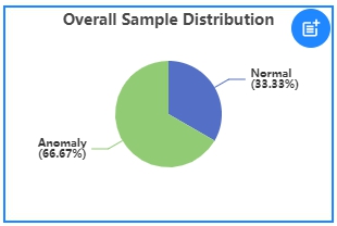
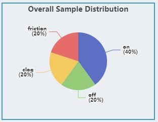
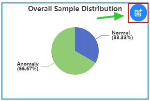
Overall Sample Distribution
The overall sample distribution graph shows the distribution of labels for all the data in the project, which allows users to analyze the data balance.
Anomaly Detection
The graph shows the distribution of Normal samples and Anomaly samples.
Classification
The graph shows the distribution of all classes.
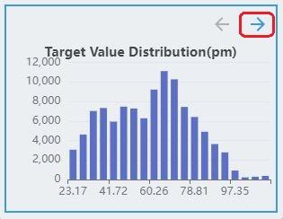
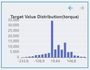
Regression
The labels of the regression task are continuous values. Therefore, the distribution of labels is discretized and displayed as a histogram, where the x-axis represents the target value. The y-axis represents the number of samples in the interval.
The regression task supports multiple targets. If the dataset contains multiple targets, click the direction arrow button to see the distribution of other targets.
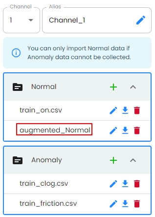
Auto Data Augmentation
The auto data augmentation feature provides automated data augmentation capabilities to enhance dataset diversity and improve model robustness. This feature automatically generates synthetic samples by applying various transformation techniques to the original data.
Benefits
Increased Dataset Size: Expands limited datasets by generating new samples
Improved Model Generalization: Helps models learn more robust features
Class Imbalance Mitigation: Balances the underrepresented classes by generating more samples
Reduced Overfitting: Provides more diverse training data to prevent overfitting
How to Use
Click the button and initiate the auto data augmentation process.
The augmentation process begins, and a progress indicator is displayed. If needed, you can cancel the process at any time.
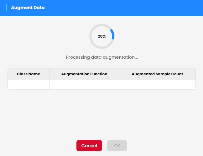
Note: The augmentation process can take some time depending on the dataset size and complexity.
Once the augmentation is complete, the results are displayed in a summary table showing the number of new samples generated.
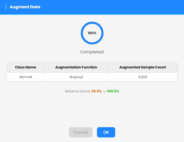
The newly generated augmented samples are automatically added to the dataset when you exit the augmentation dialog. The augmented data are available for model training.